

Some color palettes are inspired by flowers, landscapes, or changing seasons.
Others are born from atmosphere.
On July 14, Paris celebrates Bastille Day, a day deeply connected to French history and national identity. It felt like the perfect moment to revisit one of the city’s most symbolic monuments: the July Column, illuminated in the night sky.
Standing proudly above Place de la Bastille, the monument appears almost cinematic after dark. Bronze, white marble, shadows, and warm city lights merge into a quiet composition that feels both historical and timeless.
The result is a palette that feels dignified, contemplative, and quietly luxurious.
PIN IT FOR LATER 📌
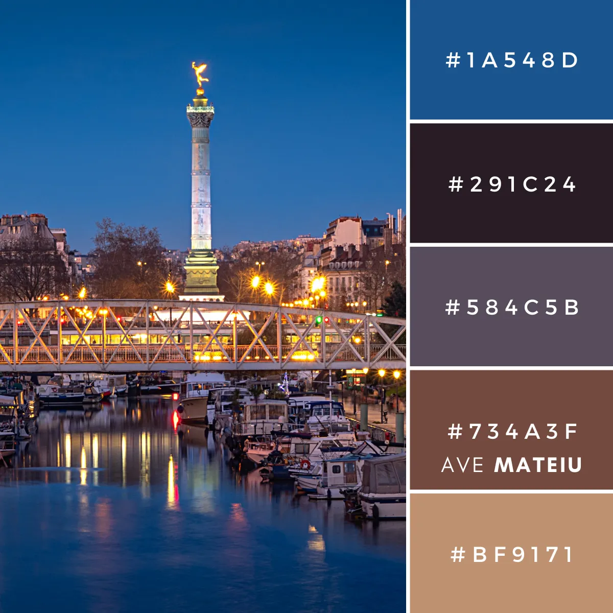

© by pierre9x6 from Pixabay @ Canva // canva.com
Azure #1A548D
The strongest visual statement within the palette.
This deep azure immediately introduces structure and confidence. Unlike brighter blues that feel youthful or playful, this shade feels composed and established.
It evokes the calm assurance of a city that carries centuries of history with ease.
As a design color, Azure works beautifully as a focal point, adding depth and refinement without becoming overwhelming.
Dark Gray Magenta #291C24
The darkest shade in the palette.
Nearly black, yet softened by subtle plum and magenta undertones, this color creates depth without the severity of pure black.
It feels intimate and atmospheric, like the shadows that settle over Parisian streets after evening falls.
This shade grounds the entire palette and allows the lighter colors to stand out with greater presence.
Gray Neon Pink #584C5B
A muted gray infused with dusty rose undertones.
This color introduces complexity and softness, sitting comfortably between warmth and coolness.
It resembles weathered stone touched by city lights, carrying an understated elegance that prevents the palette from feeling overly formal.
Gray Neon Pink acts as a beautiful transitional shade, softening contrasts while maintaining visual interest.
Gray Brown #734A3F
A warm and historical color inspired by aged materials and architectural details.
Its muted brown undertones bring substance and humanity to the palette.
There is something lasting about this shade.
It feels inherited rather than created. Like old monuments, antique interiors, and objects that become more beautiful with time.
Gray Brown prevents the cooler tones from feeling distant and introduces a sense of continuity and heritage.
Gray Orange #BF9171
The lightest color in this palette.
Soft, restrained, and gently luminous, this grayed amber resembles stone catching the glow of streetlights after sunset.
It introduces warmth without brightness and light without harsh contrast.
Rather than demanding attention, it quietly softens the entire composition. Its subtle radiance gives the palette its atmospheric quality.
Why These Colors Work Together
Color Palette 421 is built on balance:
- Cool blues and dark neutrals establish structure and permanence.
- Muted browns and softened orange tones introduce warmth and familiarity.
Rather than relying on strong contrast or highly saturated colors, the palette creates depth through restraint. Nothing competes. Nothing feels excessive.
Each shade contributes to a shared atmosphere that feels mature, timeless, and quietly sophisticated.
Suggested Uses for This Palette
Color Palette 421 works particularly well for projects that seek elegance and atmosphere.
I could easily imagine these colors being used for:
- Luxury and editorial branding
- Sophisticated wedding stationery
- Historical mood boards
- Autumn and evening fashion inspiration
- Interior design concepts
- Book covers and literary projects
- Premium website aesthetics
The combination of cool structure and softened warmth allows the palette to feel both refined and approachable.
The Feeling Behind the Palette
Colors shape perception. This palette feels like quiet conversations, lingering memories, and the stillness that arrives when the city finally slows down:
- The deep azure suggests confidence and direction.
- The softened neutrals introduce permanence and calm.
- Together, these tones create an atmosphere where history, light, and emotion become inseparable.
Whether viewed as a tribute to Bastille Day, an appreciation of Paris after dark, or simply a study in understated elegance, this palette serves as a reminder that some of the most beautiful colors reveal themselves at night.
xxAve
Leave a comment