

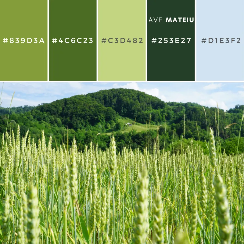
Welcome to my blog! For me, early June sits between freshness and maturity.
This palette reflects that balance through a progression of greens, softened by wheat tones and atmospheric blue.
Unlike summer palettes, these colors feel grounded, natural, and visually stable. Together, they create a sense of calm growth rather than dramatic energy.
PIN IT FOR LATER 📌
© by mpmisaart from pixabay @ Canva // canva.com
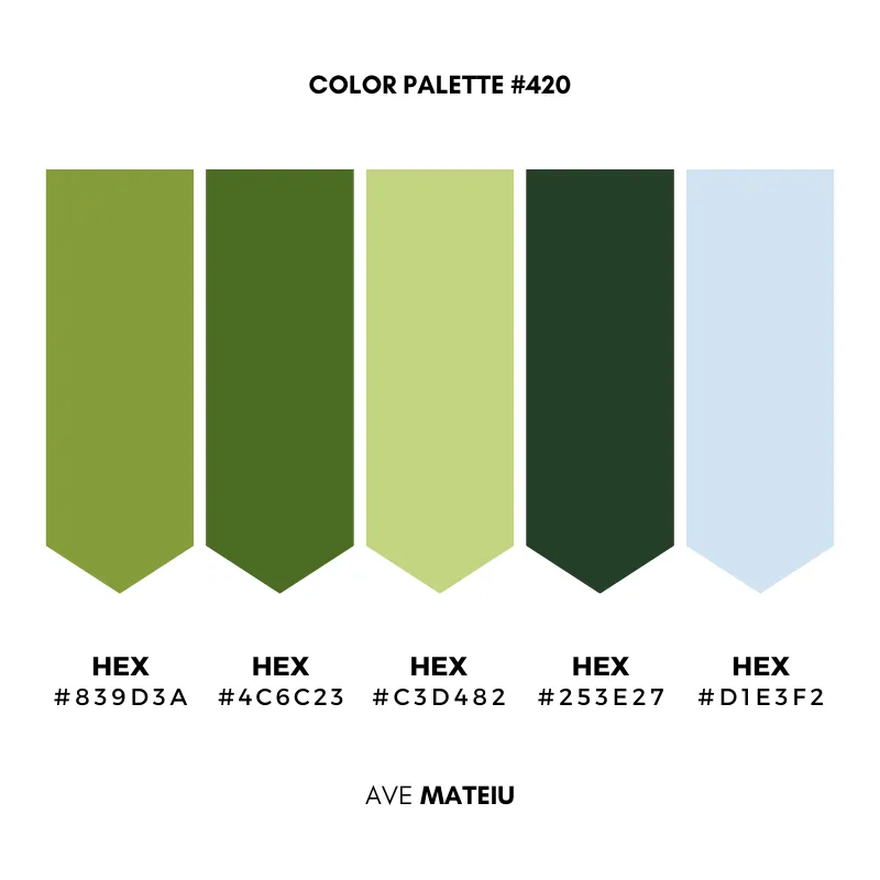
Seasonal Growth Green #839d3a
This is the color that carries movement.
Best for: Neither muted nor overly vibrant, it brings energy while remaining approachable. Use it when a design needs life without becoming visually loud.
Earth Olive Green #4c6c23
This shade introduces warmth into the palette.
Best for: Olive greens tend to feel practical, established, and connected to nature. They pair exceptionally well with natural wood, linen textures, stone surfaces, and organic materials.
Wheat Field Light #c3d482
Light yellow-greens often function as transitional colors.
Best for: Here, it softens the stronger greens and creates breathing room. It works beautifully as a background tone, secondary accent, or supporting color in layouts that need openness.
Deep Forest Green #253e27
The darkest color in the palette acts as an anchor.
Best for: Use it when you want visual weight, contrast, or definition. It works particularly well for headings, furniture, cabinetry, brand accents, and focal elements that need presence without feeling harsh.
Atmospheric Sky Tint #d1e3f2
The lightest tone introduces distance and softness.
Best for: Used sparingly, it prevents the palette from feeling heavy. It adds visual air and helps balance the earthier colors below it.
Why These Colors Work Together
Many palettes rely on contrast.
This one relies on progression.
The colors move naturally from depth to lightness, creating a visual flow that feels familiar because it mirrors patterns often found in nature.
The result is a palette that feels balanced, approachable, and easy to live with.
Whether used in interiors, branding, digital design, or creative projects, these colors create an atmosphere of quiet confidence rather than attention-seeking intensity.
xxAve
Leave a comment