


This color palette is a beautiful combination of shades that will make your eyes light up!
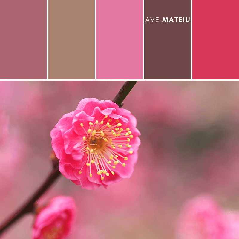
First, let’s talk about #AC6772. This color is like a rich, velvety wine. It’s warm and inviting, just like a cozy fireplace on a cold winter night. It adds a touch of elegance and sophistication to any design.
Next up is #AA8171. This shade reminds me of a cup of hot cocoa with a sprinkling of cinnamon on top. It’s a comforting color that brings a sense of warmth and coziness. It’s perfect for creating a welcoming and relaxed atmosphere.
Now let’s move on to #E3769E. This color is like a burst of pink bubblegum! It’s fun, playful, and full of energy. It’s a great choice if you want to add a pop of excitement to your design.
#6D4745 is a deep, earthy brown that reminds me of freshly brewed coffee. It’s a grounding color that adds a sense of stability and trustworthiness. It’s perfect for creating a sense of reliability in your design.
Lastly, we have #D63758. This vibrant shade of red is like a juicy strawberry on a sunny summer day. It’s bold, passionate, and full of life. It instantly grabs attention and adds an element of excitement to any design.
Overall, this color palette offers a mix of warmth, playfulness, sophistication, and excitement. It’s a versatile combination that can be used in various design projects, from branding to website design.
So go ahead and let these colors bring your creations to life!
xxAve
If you found this post helpful, why not show your appreciation with a tip?
No matter how big or small, your gesture will be greatly appreciated.