

Welcome to my blog! Some sunsets are remembered for their color. Others are remembered for their atmosphere.
This palette captures the moment when the sun begins to lower, the sky becomes saturated with warmth, and the silhouettes of palm trees start to emerge against the fading light.
Rather than relying on bright tropical tones, these colors create a richer visual experience through contrast between luminous warmth and deep shadow.
PIN IT FOR LATER 📌

© by lifeforstock @ Freepik // freepik.com
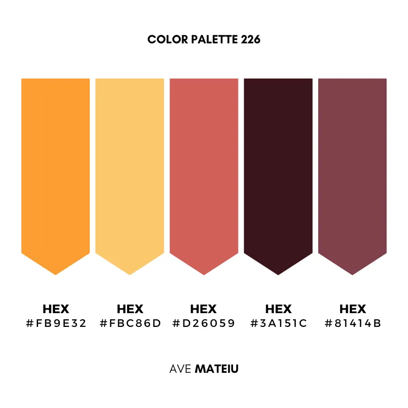
Sunset Orange #FB9E32
The brightest color in the palette.
Best for: This orange immediately attracts attention and introduces warmth, energy, and movement. It works best as an accent or focal color, bringing vitality to a composition without overwhelming it.
Golden Light #FBC86D
Softer and more relaxed than the orange, this golden yellow provides balance.
Best for: It helps distribute light throughout the palette and creates a sense of openness. Used alongside darker shades, it prevents the overall composition from feeling too heavy.
Tropical Coral #D26059
Positioned between red, pink, and orange, this shade introduces personality.
Best for: It carries warmth while remaining sophisticated, making it useful for creating visual interest without relying on high contrast.
Palm Tree Shadow #3A151C
The darkest color in the collection.
Best for: This deep brown-red functions as an anchor, providing structure and definition. Like the silhouette of the palm tree against a sunset sky, it creates strong visual presence while allowing the brighter colors to shine.
Evening Plum #81414B
A muted reddish plum that bridges warmth and shadow.
Best for: This color helps connect the lighter sunset tones with the darker elements of the palette, creating a smooth transition between brightness and depth.
Why These Colors Work Together
Many sunset palettes focus entirely on light.
This palette includes both light and shadow.
The warm oranges and golds create energy and optimism, while the deeper reds and dark plum tones introduce stability and contrast. The result feels more atmospheric and layered than a typical tropical color scheme.
Instead of competing for attention, the colors support one another by gradually moving from brightness into depth.
The Feeling Behind the Palette
Color influences atmosphere long before it communicates meaning.
This palette feels warm, but not playful. Vibrant, but not loud.
Its combination of glowing sunset tones and grounded shadows creates a sense of balance between energy and calm.
The brighter colors suggest possibility and movement. The darker tones introduce reflection and stillness.
Together, they create a palette that feels both inviting and memorable, much like the final moments of sunlight before evening takes over.
xxAve
Leave a comment