


© by Isarint Sangmanee from Getty Images @ Canva // canva.com
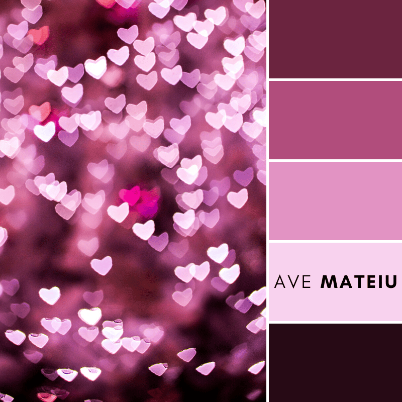
Hey lovelies! Ready to jump into this color palette and see how this colors can jazz up your projects?
First up, #6B243F – a fancy deep maroon that is all about elegance and mystery. Incorporate it into your designs for that touch of luxury, and mix it with lighter tones to keep things fresh and modern.
Now, #B04D7C – a stunning shade of orchid pink. This color is like a burst of playfulness and femininity. Perfect for spicing up fashion designs, home decor, or even a branding campaign targeting the younger audience. Remember, it’s all about stirring up feelings and making experiences stick!
Next #E292C3 – a super cute pastel pink. It’s soft and gentle, setting the mood for a chill and calming vibe. It works wonders in spa or wellness-related projects, as well as nursery designs. Mix it up with earthy tones for that perfect peaceful feel.
Moving on to #F8D2EE – a dreamy shade of pale pink. It’s like the go-to for anything romantic or girly. Use it in wedding invitations, sweet greeting cards, or websites catering to a feminine audience. It’s got this soft charm that’ll totally grab attention.
Finally, let’s talk about #270A14 – this deep and intense black cherry shade. It’s like the drama queen of colors, oozing power and sophistication. Use it in your logo design, or packaging.
Remember, the trick to awesome designs is feeling the vibes colors bring and using them with purpose. Happy creating!
xxAve
If you found this post helpful, why not show your appreciation with a tip?
No matter how big or small, your gesture will be greatly appreciated.