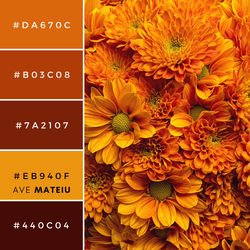
© by carlofranco @ Canva // canva.com
This color palette is a masterstroke of warmth, sophistication, and versatility. Each color within it is like a brushstroke on a canvas, and the possibilities for creativity are boundless.
The combination of warm and earthy tones evokes a sense of rustic charm and coziness. Here are my thoughts on the individual colors:
#DA670C: This rich burnt orange adds a touch of warmth and energy. It’s perfect for creating focal points and injecting vibrancy into a design.
#B03C08: The deep terracotta hue is both bold and inviting. It’s an excellent choice for creating a strong, grounded presence in any project.
#7A2107: A darker reddish-brown, this color exudes an earthy elegance. It can be used to add depth and a touch of sophistication to designs.
#EB940F: The bright sunflower yellow brings a sense of playfulness and optimism. It’s a great choice for accents that demand attention.
#440C04: This dark chocolate brown serves as a versatile neutral. It provides contrast and can be a solid background choice for text and other elements.
As someone deeply immersed in the world of colors, I’m excited to guide you on how to make the most of these beautiful hues across different domains:
Weddings: These colors are perfect for creating a memorable wedding aesthetic. Imagine using the deep terracotta #B03C08 for table settings and decor to add a rich, grounded tone to the atmosphere. Complement this with the sunflower yellow #EB940F in floral arrangements and invitations to bring an air of joy and optimism. The dark chocolate brown #440C04 can be incorporated in subtle details, creating a harmonious and elegant contrast.
Web and Graphic Design: These colors can bring websites and graphics to life. The burnt orange #DA670C is attention-grabbing and can be used for call-to-action buttons. The deep terracotta and sunflower yellow can form a warm, inviting color scheme, while the dark brown and reddish-brown offer excellent choices for background elements or typography.
Painting: If you’re an artist, these colors are a treasure. The versatility of this color palette allows you to craft landscapes, portraits, or abstract works that convey a sense of depth, warmth, and emotion. Experiment with the rich orange and deep terracotta for bold, expressive strokes, and use the sunflower yellow for accents to draw the eye.
Interior Design: These colors are ideal for interior spaces. The reddish-brown and deep terracotta can be used for accent walls or upholstery, bringing warmth and elegance to a room. The sunflower yellow adds energy to the space, while the dark chocolate brown provides a timeless, grounding effect.
Wardrobe: Incorporate these colors into your wardrobe for a stylish, coordinated look. The burnt orange and terracotta can be stunning choices for dresses or accessories. Sunflower yellow can be a lively addition to your summer wardrobe. The dark chocolate brown offers classic versatility for shoes and handbags.
Whether it’s for weddings, web design, painting, interior design, or fashion, these hues open doors to endless creative possibilities. Incorporating these colors into your projects can result in designs that feel both inviting and dynamic.
If you’re inspired to create something after reading this, I’d love to know about it! Leave me a comment below, tag me on Instagram / Facebook / Twitter / Pinterest / TikTok or send me a message via the contact form. I’m always excited to see what my readers are up to!
If you found this post helpful, why not show your appreciation with a tip?
No matter how big or small, your gesture will be greatly appreciated.
What's Your Reaction?
I'm an entrepreneur whose passion is to help others achieve success online. I believe that life is a never-ending journey of learning and growth. I enjoy taking challenges on weekdays and watching web series on weekends.


