

© by Ruben Jimenez @ Pinterest // pinterest.com
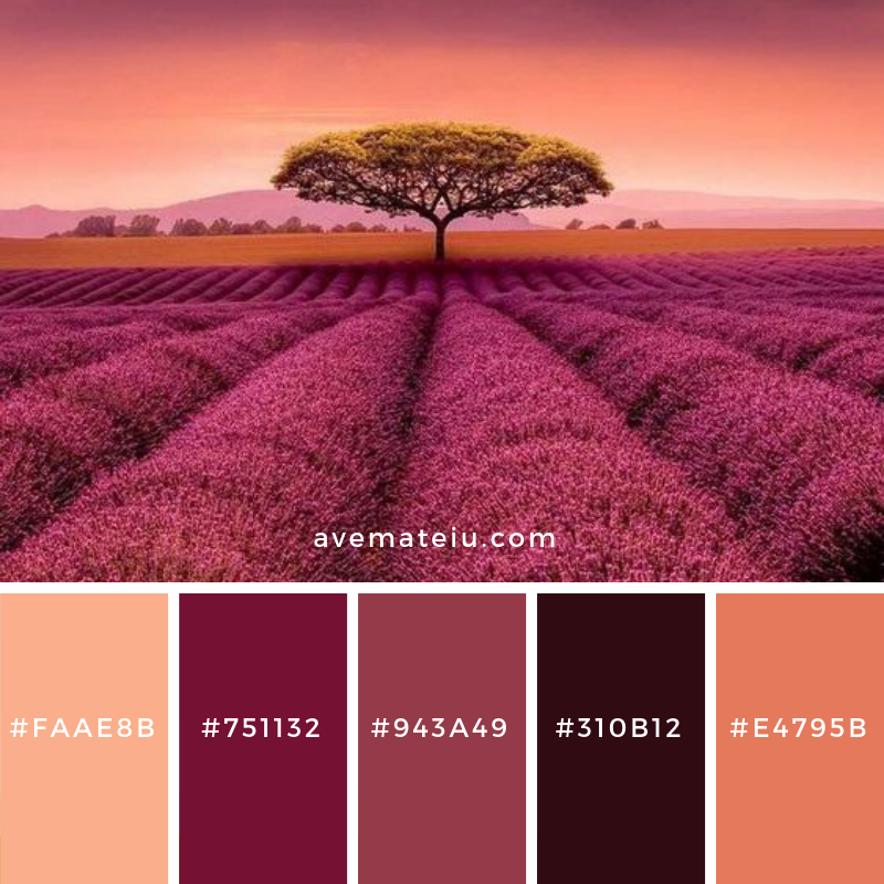
These colors create a warm and inviting atmosphere, just like sitting around a cozy campfire on a cool autumn night.
The first color, #FAAE8B, is a soft and soothing shade of orange. It reminds me of freshly picked peaches or the warm glow of a sunrise. It brings a sense of comfort and happiness to any design.
Next, we have #751132, a deep and rich burgundy shade. It’s bold and mysterious, like a glass of red wine or the petals of a velvety rose. This color adds depth and elegance to your palette.
Moving on to #943A49, a vibrant and passionate shade of red. It’s like the color of ripe cherries or a heart bursting with love. It instantly grabs attention and adds a touch of excitement to any design.
Then we have #310B12, a dark and intense shade of maroon. It’s reminiscent of a midnight sky or a velvety piece of chocolate. This color brings a sense of sophistication and depth to your palette.
Lastly, we have #E4795B, a warm and inviting shade of coral. It’s like a sunset on a tropical beach or a juicy slice of watermelon. This color adds a pop of energy and playfulness to your design.
Overall, this color palette combines warm and earthy tones with bold and vibrant accents. It’s a perfect balance between comfort and excitement, making it suitable for various designs, from websites and logos to interior decor.
xxAve
Leave a comment